Monday 16 February 2015

The Digital Age

The Digital Age, also known as the Information Age, is known as the shift which took place from the traditional industry to the computerized one. This is typically associated with the 'digital revolution'.

This had an obvious effect on the likes of art and design, and there are ample amounts of examples which involve a large range of art forms. One particular art form I'm going to briefly look at is animation, specifically motion picture and it's progression.

Walt Disney Animation Studios was founded in 1923 (originally established under the name 'Disney Brothers Cartoon Studio') and is one of the most renowned animation studios in the motion picture industry to date. Having developed many of the techniques and basic principles of traditional animation and seeing how far it has advanced to present date, this studio has played an elaborate role in what we know as the digital age, and I have chosen to look at this specific form of animation as it shows a clear visual of progression from hand drawn animation to, more recently, 3D animation and CGI - and I believe this helps reflect a representation of 'before and after' with regards to the digital revolution.

The very first feature length animation from Disney was Snow White and the Seven Dwarves (1937). The movie was worked on by many animators within the studio, but the man with the authoritative say on any and all of its concept design was Albert Hurter.


Although met with a lot of scrutiny and critique (even before it was released) this feature length animation proved to be a success and set the future standards for the Walt Disney Company.

This still from the animation provides us with a visual example on the overall feel and style of the animation from the beginning of the Walt Disney timeline. It is clearly produced by hand and, looking back on it now, it has a vintage quality to it which helps provide that nostalgic feeling. However, times have progressed, and so has the ways of animation. Despite the hand drawn Disney being a well loved method - contemporary audiences don't have that nostalgic quality to hold onto and thus techniques must change in order for them to maintain their status and popularity. This is where the digital age comes into play.

Big Hero 6 is Disney's most recent animated feature and it displays a startling difference to that of Snow White. Of course, this is only natural as not only have methods of animation improved with the addition of technology, but the animators whom work at Disney have also changed and improved. 

This particular movie involved the work of over 90 animators and took over 2 years to produce, using an array of software programs to produce the movie's vast amount of distinctive characters, locations and even lighting. 


If we compare this still to the one of Snow White, the progression which has taken place within the animation industry (and the art industry as a whole) becomes apparent. The digital age has consumed the likes of art and design, and although some people may question whether this is a positive or a negative, it can't be denied that we have come admirable lengths in our artistic portrayals. Yes, the old methods and techniques (specifically Disney's) are magical and whimsical and remind many of us of our childhood, but the future is just a bright with it's new innovative designs and fancy technology. 

Russian Constructivism

Russian Constructivism was an art movement that originated in Russia during the 20th century (roughly 1919). It was considered to be highly influential, impacting upon the likes of of architecture, graphic design, and even affecting some of the bigger, more leading movements such as Bauhaus and De Stijl. This particular movement also took on the 'art for use' mind set, favouring art as a form of political aid and steering it towards more social purposes.

The effect that Constructivism had on graphic design was vast, and much of the artwork from this period can be seen in the form of posters (typically a mix of political propaganda and cinema adverts) or book designs. Although the artwork of this period was often created through traditional means, an exploration of artistic creation through different means began and an influx of work involving film and photography was produced. Artists also began accommodating the likes of geometrics and abstract forms into their artwork, even incorporating different materials such as plastic and metal to further enhance their pieces.

The Stenberg brothers, Vladimir and Georgii Stenber, played a crucial role within the Constructivism movement and their most significant pieces of work related to graphic design involved advertisement posters for the ever escalating cinema industry.


This poster was done for the German film Which of the Two/Manhunt (1926) and features an interesting use of circles which help emphasize the perspective of the piece, creating a sense of depth between the two figures and giving the poster an almost 3D effect. The use of colours also helps define the abstract values of the piece, enhancing the varied use of shapes and overall allowing the advertisement to 'pop' from the page.

After evaluating several of the Stenberg brothers' pieces I noticed a few recurring themes. These included the use of circular shapes (reinforcing the idea that geometrics was beginning to play a large, experimental role within design), contrasting colours which usually varied from startling yellows and reds against more monochrome tones, and surreal undertones - whether suggested subtly through use of perspective or more boldly in the design as a whole.

All in all I feel that their work is a good example of the effect Russian Constructivism had on art and design as it features all the explorational factors which were being delved into at the time. Their style of work is really quite fascinating, and I find their use of perspective to be perplexing in a way that could only further enhance the piece and it's brilliance.

Other artists to be acknowledged from this period are El Lissitzky and Alexander Rodchenko.

Sources used:

The Cold War's Effect On Art & Design

The Cold War (1950 - 1970) was a balky relationship conceived between the United States, the Soviet Union, and each of their allies, taking place just after the devastation of World War II. This war was said to be like no other as the opposing sides never collided directly in battle, yet the constant threat of even further devastation after the happenings of World War II remained. This particular period was incredibly grim and was central to many major crises, taking an extensive affect on the likes of art and design (especially with the clash of contrasting beliefs and ideology).

Space Hat, Edward Mann (1965)


During this period Futurism, an art movement which focused on the aesthetics of technology, began to influence design - taking a hold of everything from fashion to architecture. This new found theme was dubbed the Space Age, and visual examples can be seen taking effect during the Cold War.


'Oasis No.7', Haus-Rucker-Co.

Although not necessarily linked with Futurism, this installation by Haus-Rucker-Co. features some Space Age aesthetics and definitely has the capacity to give of the theme's general vibe. The Oasis No.7 was a form of pneumatic architect which was a result of the increasing amounts of anxiety over the effects modern technology was having on the environment. This particular futuristic bubble was designed to not only protect its occupants, but nature too.


Another bizarre design from Haus-Rucker Co. was their series of headgear designed to detach the wearer from the real world and change their perception of space. These conceptual helmets, known as 'Flyhead', 'Viewatomiser', and 'Drizzler', were even said to go as far as repressing the senses.


There was also the introduction of new materials during this period which allowed designers to experiment and we begin to see the likes of mass manufacturing come into play. This challenged the traditional concept of furniture with regards to durability, stability and disposability. The plastic chair was a typical focus in the midst of all this and both Charles and Ray Earnes became known for their experimentation revolving around this particular products and the use of fibreglass.


Democratic design was an additional aspect which came to light during the Cold War, and with it the micro car was born. This car became a big part of post war Europe as they were not only affordable but easily and quickly manufactured. The Messerschmitt Kabinenroller of 1955 is a prime example:


Although there are a lot more examples which emphasize the effect the Cold War had on art and design, the ones given vary and compare in such a way that I feel these effects have been represented to their full extent. Not only did the design of things become alienated by this period, but the very concepts behind the work was also bizarre and in a way - genius. This shift in ideas and beliefs, especially within the artwork, becomes increasingly interesting the more time progresses as even now in more contemporary times the designs appear futuristic and ultra modern, living up to what was dubbed the Space Age.

Sources used:

Romantic & Classical Art

Romanticism was an artistic movement which originated in Europe and took place roughly between the 1800's - 1880's. It is said to have been initiated as a response to the Industrial Revolution and backfire towards Neo-Classicism as the two were culturally conflicting. As a dominant art style which spanned for decades, the movement and its artists aimed to apprehend the likes of beauty, inquisitiveness, and emotional values within their work. Their revival of medieval-ism during this period was perceived as an attempt to escape the likes of industrialism and population growth - a factor which can be seen within many artistic works from this era.

Classicism was believed to have started in 15th Century Rome, having been revived between 1800 - 1900 to coincide with Romanticism. This particular movement pursued a more formal and restrained approach to art, seeking to capture the same essence of beauty found in Romanticism but in turn rejecting the emotional value they expressed within their movement.

ROMANTICISM ART EXAMPLES:

Wanderer Above the Sea of Fog,
Caspar David Friedrich,
1818
This particular piece by Friedrich conveys a strong sense of open space and freedom, reflecting the efforts in which this movement went through in order to break free of the cultivation of people during this period. The use of a vast and sublime landscape also resonates both the beauty and inquisitiveness often portrayed in Romanticism and creates a strong link with nature, an important aspect within this movement as a close connection with the natural world was considered mentally and morally healthy - especially for artists. The tonal values of this piece are definitely an admirable detail, too, as they create contrast and enhance the use of perspective - giving the viewer a true sense of the space conveyed within the image. The positioning of the male figure, shown to be looking across the beautiful (and completely natural) landscape, plays an important role i this piece as it suggests the figure is in awe at the view in front of him, reflecting the new-found emotional aesthetics of Romanticism and even channeling the emotions of the artist (a highly regarded and important portrayal within this movement).

Winter Afternoon,
Hans Gude,
(1847)
Another piece from this period which reflects heavily upon the beauty of nature is this image by Hans Gude. The scene depicted is of snowy banks and mountains littered with trees and a few small cabins - a very freeing and breathtaking view to say the least. What struck me most about this painting was the sheer vibrancy of the sky in contrast to the rest of the surroundings. Gude's use of colours is unmistakably accurate to that which you would see during a real afternoon sky, and the hints of these colours reflected within the surrounding snow creates such a vivid sense of realism that the viewer almost feels as if they were present. This again reflects the idea that many people/artists within this movement sought escape from the ever growing population, and in producing artwork like this I believe they may have achieved that escape if not only for a moment.

CLASSICISM ART EXAMPLE:


The Birth of Venus,
Botticelli,
(1486)
This piece is from before the revival of Classicism and is instead taken from the presumed beginnings of the movement. I feel that Botticelli's portrayals of the subjects involved in this piece help reflect the beauty they so often captured within this movement, and in having the focus a nude woman (Venus) it seems to emulate their appreciation of the human form. The scenery surrounding the figures is also very lush and appealing, however it lacks the emotional quality found in the style of Romanticism.

The difference between the two conflicting styles appears to be the fact that Classicism created aesthetically pleasing art which merely involved pleasing the viewers eye, where as Romanticism created art which was not only aesthetically pleasing but emotionally freeing. This idea is reinforced when comparing each of the examples. When looking at the visual examples provided for Romanticism, the art work stirs an emotional reaction and allows the viewer to physically feel something towards the piece. In comparison, the example given for Classicism still evokes a breathtaking awe from the viewer, but it becomes less of a physical feeling and more of an admiration of the beauty depicted within the piece. As a whole, each style displays their differences but are equally as beautiful, and it's fascinating to witness how they co-existed during the same period yet differed so vastly from one another.

Globalisation

Globalisation: The process by which businesses/organizations develop international influence or begin operating on an international scale.

Glocalisation: Globalisation & Localisation. The adaptation of items around the world, typically branded items. For example: Walkers crisps & Lays crisps, the vast variety of KitKat flavours in Japan, McDonald sizes in Britain vs. America (Regular size/Super size).

Visual examples of Globalisation/Glocalisation:

Banksy is an anonymous graffiti artist whom paints the streets with all forms of satirical art. He is known, ironically, for his lack of identity and his ability to convey political messages through his artwork, and thus creates a recurring theme of consumerism within his work.

One particular piece which relates to globalisation/consumerism is the canvas screen-print of 'Consumer Jesus'. The piece depicts the well known religious figure, Jesus, in the crucifixion pose carrying a selection of shopping bags in his hands. This piece of work is said to relate to the consumerism which typically takes place during the festivities of Christmas time (hence the use of a candy cane in one of the bags) and includes the well known brand of Disney through the incorporation of a Mickey Mouse doll. This particular detail, although very minute in scale with the rest of the piece, reflects the international influence that Disney carries all over the globe as the doll is a recognized figure, and thus globalisation becomes a highlighted theme within the image.


Another of Banksy's works which reflects the effects of globalisation is his 'Napalm' piece. The subject of this image is nine-year old Kim Phuc, originally photographed in 1972 by Nick Ut running from her home after a Napalm blast. In using such a distressing base figure for his piece and replacing the disastrous background with the figures of Mickey Mouse and Ronald McDonald, Banksy makes clear reference to the underlying negative effects of globalisation across the world, showing that while these corporate brands develop and grow on an international scale, the consumerism which accompanies it does nothing to improve the quality of life for human beings such as Kim Phuc, and thus the contrast between each figure in this piece (specifically the varying expressions) creates and intense and shocking critique aimed towards big brands and their consumers.


The Chapman Brothers are a pair of English artists who often create deliberately shocking subject matter and thus the likes of globalisation has been included in many of their projects. Their 'Wheel of Fortune' creation, which is composed of mixed medias such as glass fiber and plastic, depicts a hellish landscape scatter with dead bodies, some naked and others garbed in Nazi uniform, Ronald McDonald's and a few religious symbols such as the cross - just for good measure. This grotesque scene most certainly captures their "deliberately shocking" way with producing artwork and the use of the McDonalds' brand figure, Ronald McDonald, reinforces the idea of the negative effects behind globalisation. In creating such a frightening scene, the Chapman Brothers also force viewers to look at these particular brands in a negative light, connotating them with the unexplainable and formidable displays and thus causing and uncomfortable confusion as to what truly lies behind these big name brands.


The Designers Republic are a graphic design studio based in Sheffield, England, and are known for their anti-establishment aesthetics with a clutch on impetuous consumerism.

One of their pieces, "Work, buy, consume, die" conveys a bold and rather blunt message. The design is simple and straightforward, contains a branded logo, and basically tells you like it is, making it very direct towards the viewer and highlighting the harsh reality of our lives as consumers within globalisation. In being so up front with their message, tDR create a sense of unease among consumers as the piece suggests we have been ignorant to the effects of globalisation/consumerism for so long that the only way to get the message across is to be as direct as possible.


'The Little Book of Shocking Global Facts' is a "powerful visual manifesto highlighting the inequalities of rampant globalisation...". It was both written and designed by a British graphic designer named Jonathan Barnbrook, The book itself is divided into several different sections, including: human rights, trade, environment, war, arms trade, health population and illicit drugs and it harnesses the use of graphics, typography, photographs and statements - all of which reiterate the many social and ethical issues within our world today - in order to convey the shameful realities we are so often ignorant to.


From these visual examples of artwork which relate to globalisation and consumerism we can grasp the concept that these themes have concealed and negative effects on our environment, whether it's through the witty portrayals of Banksy, the abominable creations of the Chapman Brothers, the directness of tDR or the factual books of Barnbrook. All of these artists make it clear, and yet some (arguably) still remain ignorant.

Sources used:

The Influences Of A Single Image

Girl with a Pearl Earring.

This piece was painted by the dutch artist Johannes Vermeer and is one of his most recognized masterpieces to date. It is currently housed in the Hague, Netherlands, and has been referred to as 'the Dutch Mona Lisa' and 'the Mona Lisa of the North'.
The main focus is, of course, the pearl earring (hence the title of the painting) and this factor is reinforced through artist's use of lighting and positioning of the feminine figure. The lighting is an incredibly important aspect to this piece as it doesn't fully reveal the earring, but instead is painted to slightly 'reflect' off of it's surface and thus bring it to the viewers attention and ensuring the eye is automatically drawn to it. Vermeer was an artist renowned for his use of colour within his pieces and his 'signature' use of ultramarine can be seen in this particular painting (located on the turban headdress, the subject's neck and her back). This colour contrasts against the other, earthier tones of the piece and keeps the overall image from appearing dull and bland. His exquisite skill in under-painting also allows the painting to take on an intense and realistic depth, and the 'Dutch custom' use of a dark background enhances and accentuates the highlighted subject nicely.

Rembrandt, a highly regarded painter and print-maker in European art and one of the most important in Dutch history, was the man behind the popularity boost of the 'tronie' (17th-century Dutch for 'face') and it is suggested that Vermeer was both inspired and influenced by his works.


If we look at and compare these two paintings of Rembrandt's ('Girl at a Window' & 'Flora') to Vermeer's 'Girl with a Pearl Earring', there are some evident similarities between each of the individual works. Rembrandt's composition, earthy tones, and feminine subjects have seemingly provided Vermeer with some guidance during his studies, and it's fascinating to see how such past influences led to the masterpiece we know and admire today.

There are also several other paintings which are compared to Vermeer's classic, such as:

Portrait of a Woman,
Robert Campin,
1430

Lady Wearing a Gauze Headdress,
Rogier Van Der Weyden,
1445
Portrait of a Young Girl,
Petrus Christus,
1460
Man in a Turban,
Jan Van Eyck,
1433
And lastly 'Smiling Girl' - a painting which was donated in 1937 to the National Gallery of Art in Washington by a collector named Andrew W. Mellon. It was originally thought to be another of Vermeer's work but it is now, in fact, considered a fake:


Each of these individual works show striking similarities to the 'Girl With a Pearl Earring', whether it's in the composition of the piece, the dark backgrounds, the portrayal of headdresses (albeit they differ - they're still similar and create a recurring theme which stems from the original) and even the glowing complexions and expressions of the subjects.

Finally, with the popularity of this proclaimed masterpiece, comes a series of more contemporary adaptations (including a film).

One particular adaptation was done by the notorious artist 'Banksy' in October 2014 and appeared on a wall in Bristol Harbourside. This modern remake features an alarm box in place of the signature pearl earring and the piece was comically dubbed "Girl with the Pierced Eardrum". This piece is a brilliant and contemporary parody of such a classic, and the idea that it's displayed on an urban canvas with the modern twist of the alarm box allows us to see how art and design has progressed over the years.


This image is taken from the movie adaptation mentioned earlier (the actress being Scarlett Johannson) and it has truly captured the essence of the original - everything down to the dark background, lighting and glossy, parted lips alongside an innocent expression has been recreated effectively. The concept of recreating the painting with a photograph and giving it a story through a movie, allows us to reflect on just what we can achieve with modern technology and helps bring this classic to light for a contemporary audience.


Alexa Chung took part in another recreation of the Girl with a Pearl Earring - playing her as a character in Sky Arts 'Psychobitches', definitely a twist on the previous parody (as well as the original) and perhaps an unexpected one at that. Still, it's fascinating to see how such things can be twisted and changed to meet contemporary tastes and interests.


Finally, Dorothee Golz is an artist who lives and works in Vienna, Austria, and has a series of pieces which takes old works of art and recreates them in modern scenarios. Her quality of work is astounding and she blends the original, painted faces in so well that it's hard to believe they're not from this time. The seamless blending paired with the modern backgrounds makes for a stunning finished product and to see such well-known classics in a present-day environment is not only surreal but appealing, too.


It truly is amazing to see how one singular image, having blossomed from influences from another time, can help influence and create works in another, more current point in time. As evident from the research above, the Girl with a Pearl Earring by Vermeer was influenced by a master in the Dutch arts, and later became known and admired as a masterpiece itself - eventually influencing the work we see now. To know that these artistic chain reactions happen constantly and will continue to do so is incredibly exciting and the evolution of art and design will show that original classics can always be taken further.

Sources used:

"English-ness" - National Identity

Symbol: A mark or character which is used for a conventional representation of another object.

National Identity: The identity of a nation as a cohesive whole, usually represented by distinctive traditions, culture and language.

There is a lot of speculation over the fact that England has no 'national identity', and that any past symbols of England are constantly being changed and influenced by those of other countries (For example: The likes of McDonalds and Starbucks are cropping up everywhere, both of which are American brands).

However, this isn't entirely true. England is a vast country, and many different parts have different icons and symbols which represent their locality. In retaliation to the abundance of McDonalds which seem to be appearing out of nowhere, England also has a sense of local identity in the likes of Gregg's, a bakery which was founded in the North East of England and has since grown immensely. London, our capitol, has it's quirks too. Their red double decker buses having a similar representation to the yellow taxis always depicted in New York. It could be argued that our identity also resides in the likes of our beaches, typical cold weather, full English breakfasts (the proof is in the name), "posh accents" and our love of a hot cup of tea. While many of these may be stereotypical, there remains at least some truth in them and thus a sense of 'identity' is created for our nation.

Other cultural icons include:

    • The Barbary Lion - Frequently depicted in English Heraldy, sculptures can be found at Trafalgar Square.
    • The Rose - Considered our national flower and is usually portrayed as red in colour.
    • The Oak - National tree of England, represent strength and endurance.
    • Rost Beef and Yorkshire Pudding - Largely consumed across the nation and could be considered the nation dish, however, fish and chips is also known as and English cuisine by those all over the globe.
    • Robin Hood - A heroic outlaw in English folklore, recognized as a national identity. Also links in with the oak tree (Sherwood Forest).


Grayson Perry is an English artist known mostly for his oddly attractive ceramic-vases. In correlation with this research, he also produced a series of tapestry works which "elevate the commonplace dramas of modern British life". These tapestries were primarily influenced by 'A Rake's Progress' by William Hogarth (1732 - 33) and two are composed from Perry's first hand experiences and meetings of characters within Sunderland. 

The Adoration of Cage Fighters (2012)
The Agony in the Car Park (2012)
Both tapestries include iconic and aesthetic references to Sunderland, reflecting things such as our historical background with the shipyard and the mines, our location on the coast, our apparent taste in brands (Adidas) and lager, and even the makings of a typical British roast (the contents of the picnic basket in 'The Agony in the Car Park'). Even the group of women depicted in 'The Adoration of Cage Fighters' are based off of physical figures which Perry met whilst here. All of these individual aspects emulate a sense of Sunderland, some factors more flattering than others, and thus cast an impression of our identity. Perry's depictions of our thriving city are, in a way, slightly ludicrous paired with his style of work, but it's definitely thrilling to see our local identity broadcast in such a manner as it truly does imitate the spirit of our city.

Thus comes the conclusion that England does, after all, maintain some sense of identity. Even as a smaller city up in the North East of the country, we have shown a distinct impression of who we are and what we're about, and this is reflected in the likes of Grayson Perry's artwork. We may not have the most well-defined cultural icons, but taking into consideration how vastly identifiable we are by our stereotypical love for tea and a good beef roast, it's safe to say we will remain distinguishable no matter how many McDonald's, Starbucks' or high street brands take their places within our nation.

Sources used:

Monday 2 February 2015

Perspective

Perspective is widely used in art to either create a sense of open or confined space within an image, and each gives a varying effect on the artwork in which it is used in. For example, a piece with an open perspective would provide the viewer with a transporting perception of atmosphere, opening up the image in which they're viewing and allowing a sense of freedom to be induced. A piece with a more confined use of perspective, however, would have the opposite effect - and instead the viewer will typically feel more enclosed and even uncomfortable with what they're viewing, the sense of freedom being switched for entrapment.

Alfred Stieglitz was an American photographer with a determination to prove that photography was a medium capable of providing the same artistic expression given by more typical mediums, such as drawing and painting. He achieved this through taking a variety of expressive photographs of different subjects from people to the streets of New York.

Two photographs which he took of New York in particular help convey a sense of open spaced perspective. As you can see the scenes captured in both photographs have the ability to make the viewer feel as if they are actually stood within that area, and because of the expanse in each image the viewer is able to feel relaxed. This is strikingly interesting as the photographs are black and white, and these monochrome tones are what often make confined imagery reflect a sense of unease.
The people captured within the first photograph help fabricate an atmosphere, and the idea that they're going about their daily lives again reinforces the relaxed feeling of the image, creating a sense of normality. The same applies to the second image, despite it's lack of hustle and bustle. A street view is something which is familiar to all of us, and thus again we are given normality.


However, Stieglitz's photography also contains some examples of confined perspective - and it's interesting to see the contrast created between the two types.


This photograph in particular is a brilliant example of confined perspective because the nude subject takes up the entirety of the photograph and makes itself the inevitable focus. The viewer is forced to look at something which is considered personal and thus a shock factor is created - the feeling of entrapment and discomfort therefore exaggerated. The intimacy of such a subject (nudity) makes the photograph feel private, and although it is publicly displayed we are made to feel as if we are intruding on the moment in which the photograph was taken. When compared to the other two, open spaced photographs, it becomes evident that a confined perspective builds tension where as the open spaced perspective is more lenient, allowing breathing room for the viewer.
With all of this taken into consideration, it becomes clear that the use of perspective within art has an effect on both visual perception and emotion. A more open image is pleasing and easy to view - making it an enjoyable experience for the viewer. However, a more constricted image causes discomfort and the experience becomes less pleasurable. This makes the use of perspective in art incredibly important, especially if the artist desires a certain reaction to their creation, and the varied effects this particular aspect has on viewers is intriguing to observe.

Sources used:

Thursday 29 January 2015

Surrealism

Surrealism was developed from the 'Dada', a band of artists with a gloomy outlook on the effects of the first world war (believing it was the be all and end all of art and thus causing them to create 'pointless' art - birthing surrealism). The surrealist movement originated in Western Europe, particularly France and Germany, but the most important center of the movement was Paris as this is where the surrealist clique was formed. From the 1920's onwards the movement spread globally, effecting an array of things with it, such as the visual arts, film and even literature.

Leonora Carrington, a Mexican surrealist painter born in Britain, is a personal favourite of mine. She is known for being one of the final remaining surrealist artists from the movement (although now deceased as of 2011) and was introduced to the likes of Surrealism/Max Ernst after receiving a copy of 'Surrealism' by Herbert Read's (1936). With somewhat of a fiery attitude and plenty of eccentricities, I find Carrington to be a perfect fit within Surrealism and even more so of an inspiration.


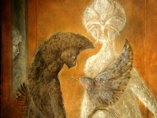
This particular piece, "The Giantess (the Guardian of the Egg)" (tempera on wood panel) displays an array of exotic colours over a rough texture which truly help bring forth the sweeping, giant figure - allowing it to take center stage amongst the landscape and unusual creatures which surround her. Some of my favourite details in this picturesque scene are that of which are mostly minute, such as the golden corn which surrounds the Giantess' head like a mane, or the figures detailed on her red garb, and even the far off mountains and islands which are scattered in the background - emphasising her enormity. Most of all, though, I really love the overall aura of the piece. I understand that it's Surrealism but I can't help but be reminded of the the illustrations we so often see grace the pages of children's fairytale books, which in turn are often very surreal themselves (this could also relate to the fact that Carrington was not only artistically involved in painting, but writing too.)

Another painting done by Carrington is "El recital de los sueƱos" which depicts four different figures whom all appear to be in an uncomfortably small space with one another. With the three bizarre and rather ethereal creatures being the main focus of the piece, the fourth (and more 'human' in appearance) of the batch becomes quite an eerie presence as it's shown isolated from the rest - peering in from behind what appears to be a pane of glass. The presence of this outcast figure begins to become more fathomable, however, once the title of this piece has been translated into English (The Recital of Dreams). Although still a rather spectral presence, it's understandable that this figure is depicted in this way as it appears to be one watching the dream unfold in front of them, thus reinforcing the title and meaning behind the piece. Much like the previous painting, I love both the use of colours and texture within this dream-like scene. The warm tones make the scene appear welcoming, however the strange creatures then create a contrast by creating a sense of unease as the viewer is forced to think "What are they?" and I personally believe these mixed emotions are exactly what dreams are all about: confusion and uncertainty.

Dorothea Tanning, a self-taught artist who found herself undoubtedly impressed by the exhibition 'Fantastic Art, Dada, Surrealism' located at the Museum of Modern Art, later became a surrealist painter herself.

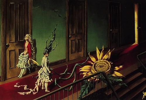
One particular painting of hers, "Eine Kleine Nachtmusik" (oil on canvas) depicts a very surreal and unfathomable scene which is said to be inspired by childhood fantasies/nightmares. The painting shows a hallway/corridor inhabited by a tattered sunflower which is surrounded by two young girls in equally as tattered clothing. The young girl in red, although not immediately apparent, is in fact a doll figure, and her representation as a toy comes from both her hairline and the molded form of her torso. The state of the sunflower and the clothes of the figures suggests there has been a struggle of sorts, and this becomes more clear upon knowing the artist's intentions in making the painting about confrontation. This allows the piece to become more flexible to public interpretation, giving viewers their own opportunity to understand what the piece is about. For example, upon viewing the piece again after gaining insight about it, I've come to believe that the confrontation took place between the doll figure and the human girl - the tattered clothes and the sunflower representing the damage done by the drama they've caused. The open door at the end of the hallway appears to be illuminating the extent of the damage caused in the heat of the moment, and in highlighting this we become aware of how fragile the bonds between things can be.

"A Mi-Voix" is another oil on canvas painting done by Tanning and it differs vastly from the painting seen above. In comparison, this piece is less refined with detail and is clouded with a variety of monochrome shapes. Tanning herself said that: "I just wanted to paint a white and grey picture that would still have colour in its veins as we have blood under our winter-white skin.", giving the piece a sense of meaning and overall enhancing its beauty despite the confusion behind it.

When I first viewed this piece of work it reminded me of an ink blot, the kind in which the viewer often sees an image built entirely of their own personal perspective, and this was something I really enjoyed about this painting/surrealism art in general. To me, the shapes and colours which help define some sense of highlighting/shadows created the illusion of three feminine figures situated around a circular table of some kind. Although I'm sure this wasn't the intentional portrayal of the painting, I thought it was interesting that this is the image I saw, whereas another viewer will more than likely view it in a completely different light.

As a whole Surrealism is definitely a fascinating art form. It allows the viewer to view a piece of work and have their own conclusion on what exactly the piece is trying to portray, whether it was the artists original intention or not. I feel that this notion broadens the horizons for artists as it allows more people to get involved in art, and the idea that an artist's work has the potential to evoke a series of different thoughts from a variety of different audiences is a truly amazing prospect.

Sources used: